Layout
Breakpoints
Breakpoints are points where the page content responds according to the device width, allowing you to display the best possible layout to the user. They are applied using media queries.
The table below shows the Chroma breakpoints, the max width for the inner container and the inherited font size.
| Breakpoint | Token | Viewport (px) | Max-width | Font-size |
|---|---|---|---|---|
| Mobile | xs | < 576 | 100% | xs |
| Tablet | sm | 576 - 767 | 960px | sm |
| Laptop | md | 768 - 991 | 960px | md |
| Desktop | lg | 992 - 1199 | 960px | lg |
| Desktop/TV | xl | 1200+ | 1140px | lg |
Grids
Chroma is built to work with tailwind css, which includes a comprehensive grid system. See the tailwind docs for in-depth information about how to implement responsive grids.
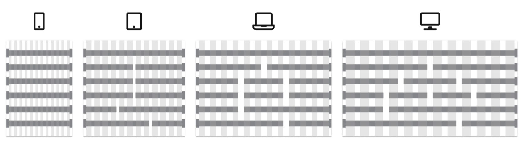
Building to a 12 column responsive grid gives the flexibility to adapt content to provide the optimal layout across each breakpoint. For optimal content readability and accessibility, the below number of columns is recommended for each breakpoint:
- xs (Mobile) - 1 column
- sm (Tablet) - up to 2 columns
- md (Laptop) - up to 3 columns
- lg (Desktop) - up to 4 columns
- xl (Desktop/TV) - up to 4 columns
Layout
Application designs should align to how it will be built to ensure it can be replicated in code. All screens should be considered in layers.
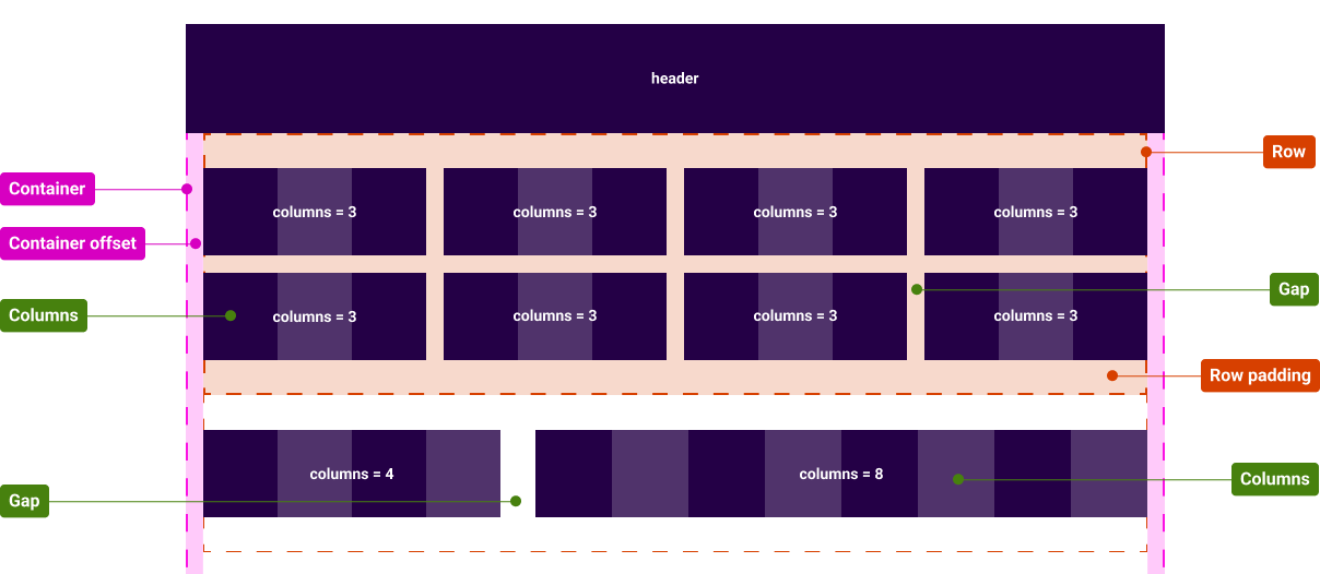
Containers
Containers hold content in a fixed width area to align content and control layout.
Containers should align with the viewports max-widths and offsets (table below). The container can also be fluid (no max-width set) where the contents needs to extend the full width of the viewport, for example Headers and Footers.
View Container component.
Rows
Inside the container, rows wrap content and control the horizontal padding.
Columns
Inside rows content elements are assigned column widths and gaps, aligning to the 12 column grid. The max content columns should follow the recommended number for each breakpoint.
There are two ways to create column layouts, equal width columns using the Grid component, or individual width columns using the Column component. Both require values to be allocated and the gap between columns to be set.
| Breakpoint | Token | Viewport (px) | Container offset | Container gutters |
|---|---|---|---|---|
| Mobile | xs | < 576 | 16px | 16px |
| Tablet | sm | 576 - 767 | 16px | 16px |
| Laptop | md | 768 - 991 | 16px | 32px |
| Desktop | lg | 992 - 1199 | 16px | 32px |
| Desktop/TV | xl | 1200+ | 30px | 32px |