Colours
White-label first
At IAG, the goal is to follow a white-label approach, which means building UIs that will work in any brand. Therefore, it's recommended to use tokens, not hex colours. Chroma colour tokens ensure the same style values are used across design files and code, offering:
- Accessible contrasting colour sets
- Colour predictability when switching brand themes
- Streamlined design and development
Static and dynamic colours
Dynamic
Primary, Secondary and Accent
Dynamic colours change per brand and communicate a brands visual identity. Their accessibility with black or white can vary per brand. For example, the primary colour may be dark purple in one brand (accessible with white), and yellow in another brand (accessible with black).
Dynamic colours come with colour sets that maintain distinct contrast ratios with the default colour. This enables dynamic colours to be applied along with their colour sets to maintain accessible contrast levels in user interfaces when changing brands.

Static
Text, Neutrals, Greys, Status, Icon, Interactive
Static colours form system colours and brand colours translated into specific use cases. Their values may differ slightly per brand, but their contrast to white or black remains consistent. For example, typography/body may be varying shades of grey across brands, but will always remain accessible with white.
Static colours allow users to be confident that the colour applied will maintain it's contrast with black or white across brands.
Where a dynamic colour cannot be guaranteed to keep the same accessibility to white or black across brands, avoid layering static and dynamic colours in a UI.
Colour sets
Colour sets include shades and contrasting colours for accessible UI design when working with dynamic brand colours, as these can be unpredictable in their contrast with black or white across different brands.
Use colour sets when UI elements are dependant on a brand colour, and need to remain accessible across all brands.
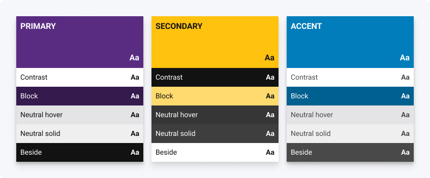
| Token | Description | Usage | Example |
|---|---|---|---|
| Default | The colour itself | Default is used to theme the UI in line with the brand’s visual identity. | Incorporating the brand colour into a banner, icon, interaction, and so forth. |
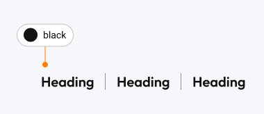
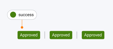
| Contrast | A colour with high contrast to the default colour, either off-black or white. | Contrast is used when overlaying colours such as text on top of the default colour. | Where a header uses the default colour as it's background, using the contrast colour for the text ensures the text remains accessible when switching brand themes. Static colours like black or white shouldn’t be used in these cases as brand colours will dynamically change in white-label apps. |
| Block | A tinted version to default that remains accessible with the contrast colour. | Block is used as a hover colour on brand-coloured backgrounds. | Where a button has a default background and contrast as it's text, using block hover for the background on hover provides a visual change in state while keeping the text accessible. |
| Neutral hover | A semi-transparent off-black or white. | Neutral hover is used as a subtle hover colour on transparent backgrounds. | Where an accordion item has a transparent background, using neutral hover for the background on hover gives a visual change in state of lighter or darker against the background container colour. |
| Neutral solid | A solid shade of off-black or white. | Neutral solid is used as a subtle hover colour on solid backgrounds. | Where an input item has a solid background, using neutral solid for the background on hover gives a visual change in state that is not impacted by the background container colour. |
| Beside | A colour accessible on the same background colours as default, either off-black or white. | Beside is used when a neutral colour is needed alongside the default and remain accessible on the same background colours. | When a card needs to highlight the default colour, you may use contrast for the background to ensure they are always accessible. Beside can be used alongside default, for text or other elements, and it’s accessibility on the contrast background can always be guaranteed. |
| Light, lighter, dark, darker | Lighter and darker shades of the default colour. | Shades are used for branded backgrounds and borders as alternatives to the default colour. | Using one of these shades where the layout background needs to incorporate the brand colour but remain accessible with the body text colour. |
Example of how the dynamic colours in a colour set change if the Default is light or dark.
Using the right colour tokens
Selecting tokens should be based on their meaning and usage, rather than their value. This ensures that the desired outcome is achieved and prevents potential issues like non-compliance with brand guidelines or the improper use of colours in common UX/UI patterns.
When choosing which token to use for layouts and UI elements, keep white-label design in mind:
- Will the token act as intended across different brands?
- Will text content remain accessible across brands?
Will backgrounds and foregrounds maintain the required contrast ratio across brands?
Testing designs in multiple brands will help ensure future proofing for accessibility and usability.
DO
Use tokens that match the intended message being communcated to ensure it remains consistent across all brands.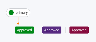
DON'T
Use at token based on its value as it may change across brands. This can change the recognition of the message and cause confusion.
DO
Use dedicated tokens where available to guarantee consistent and accurate representation of the brand across all platforms.