Chroma Tokens
Tokens consist of a name and a value that can be repeatably applied across design and code. In Chroma, token names stay the same while their value may vary across brands to bring that brand’s visual identity to life. Tokens include colour, typography, border radius, spacing and many more.
Chroma tokens are accessible by all teams to maintain consistency in visual design language and expression of our brands across all digital platforms.
Token vs Values
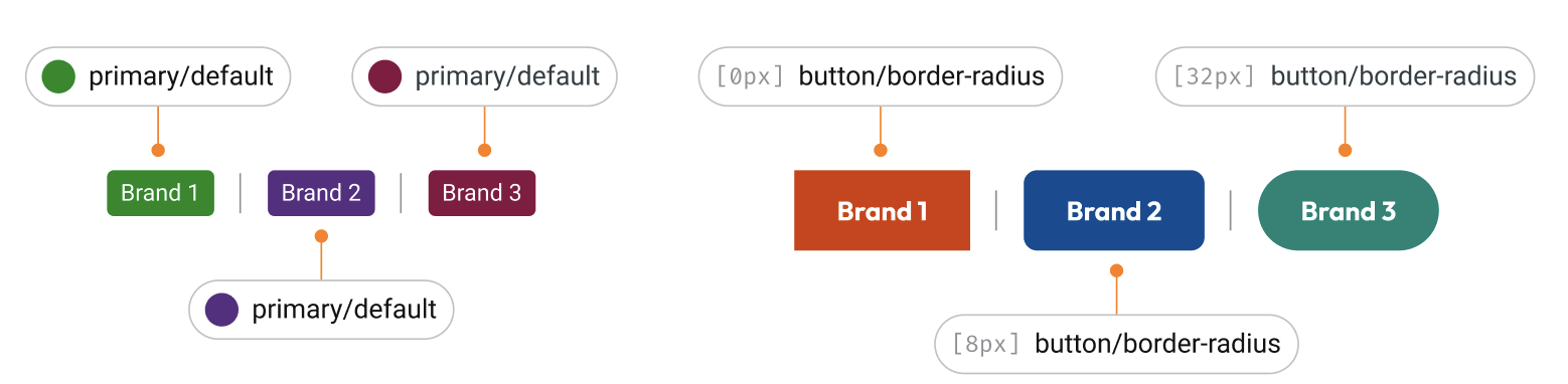
Each token has a value assigned. Token names are consistent, but their value may vary. For example, primary/default is a consistent token name. It’s value may be #008919 in one brand, and #592C82 in another. Or for border radius button/border-radius may be 2px in one brand, and 10px in another.
Token Structure
Chroma comes by default with an exhaustive list of tokens ready to use. Every token and it's value is customised based on a brand's visual identity.
Chroma’s approach breaks tokens into layers to assist in identifying which token is best to use for which purpose.
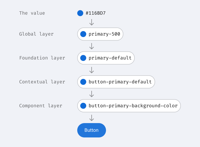
Tokens in Chroma have 4 layers:
Global: Based on a brands colour value, the global layer generates shades ranging from 50 to 950. Expect for greys, colour tokens from this level are rarely used directly. Utility tokens such as border radius, spacing, border width and box shadows are also generated at this level at set intervals and should be used for constructing UI elements and layouts.
Foundation: Translates the global layer into colour sets that you can find on the Brand colour, System colour and Text colour pages of our documentation. They are also the colours we expose in our Figma Libraries. They hold the brand identity and are not tied to a specific use.
Contextual: Pulls from the Foundation layer to define a consistent visual language for interactions, status, states etc. These sets of tokens can be called upon when creating custom components if you are leveraging already existing design elements. For example, if you require and new form component, using the interactive tokens will help align it to default, hover and focus states to other form components. Give the Chroma team a shout to help find the best tokens for your use case.
Component: These tokens define a specific element of a component, such as a input border radius or button background colour. These are component specific and can be used if you need to replicate an exact component token.
Using Tokens
Tokens exist in both code and design, however they may look slightly different. Code tokens are in the form of CSS variables and can also be applied as tailwind classes. Design tokens can be accessed via Figma styles. To find more information on selecting the best colour token, view colour usage.
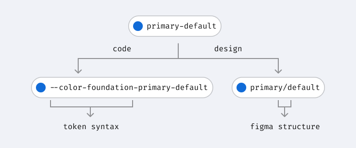
Each token set has a mapping table to assist translating between design and code: