V7 Releases
v7.2.0
Brand Tokens
NRMA
- Updated
linkdisabled color.
Previous value
--link-disabled-color: #7aa1eb;
Updated value
--link-disabled-color: #999ec2;
View NRMA link documentation
State
- Updated typography headline + compact font sizes.
Previous values
--typography-headline-font-size-sm: 2.125rem; /* tablet */
--typography-headline-font-size-md: 2.375rem; /* laptop */
--typography-headline-font-size-lg: 2.625rem; /* desktop */
--typography-headline-compact-font-size-sm: 1.875rem; /* tablet */
--typography-headline-compact-font-size-md: 2rem; /* laptop */
--typography-headline-compact-font-size-lg: 2.25rem; /* desktop */
Updated values
--typography-headline-font-size-sm: 2.375rem; /* tablet */
--typography-headline-font-size-md: 2.875rem; /* laptop */
--typography-headline-font-size-lg: 3.5rem; /* desktop */
--typography-headline-compact-font-size-sm: 2rem; /* tablet */
--typography-headline-compact-font-size-md: 2.375rem; /* laptop */
--typography-headline-compact-font-size-lg: 2.75rem; /* desktop */
View State typography documentation
AMI
- Updated footer background color.
Previous value
--footer-background-color: #0c0c0c;
Updated value
--footer-background-color: #3b3b3b;
View AMI footer documentation
Components
<ProgressIndicator />
New
<ProgressIndicator />component added.
View Progress Indicator documentation
<Button />
- Added button link disabled styling to change the icon colour.
Documentation
<Link />
- Added disabled link examples.
<Button />
- Added button link disabled examples.
- Added button icon examples.
Brand Colours
Fixed Brand Colours Foundations page so that it displays the correct brand theme colours.
View Brand Colours documentation
Asset Tokens
Added
cgu,navytheme tokens to list of token sets in the documentation.
Figma
Price component updated to remove display issues occurring with some brand fonts.
- Link disabled state added.
v7.1.0
Brand Tokens
Icons
New
iconfont-familytoken added. This token aligns with the brand specific icon font sets beinglight,regularandsolid.
Example css variable
--icon-font-family: "regular";
Icon component css variables
Components
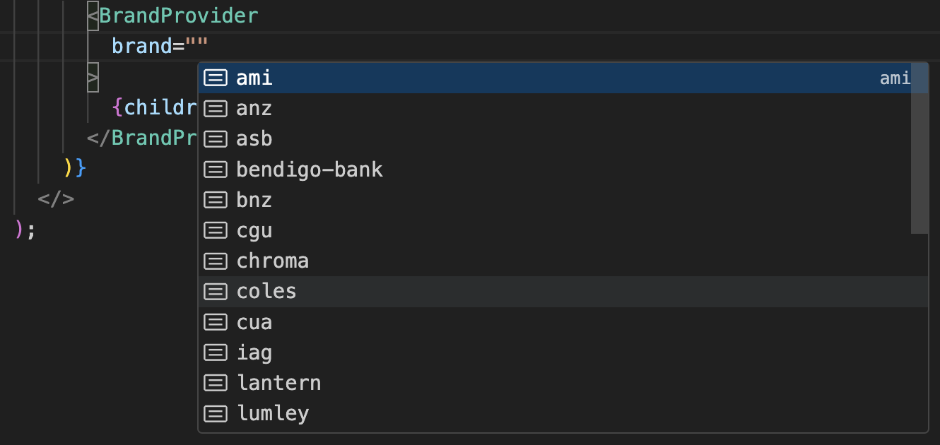
<BrandProvider />
- Updated
brandprop string definitions to match available brands.
Available brands will now display
v7.0.0
Assets
Logo files
- New logo assets added for
QBank.
- All
.pnglogo files have been removed for all brands. - Alternate logo files have been renamed for the following brands:
ANZ
logo-alt.svgrenamed tologo-alt-1.svg
Driva
logo-alternate.svgrenamed tologo-alt-1.svg
NRMA
logo-horizontal.svgrenamed tologo-alt-1.svg
Driva
logo-alternate.svgrenamed tologo-alt-1.svg
IAG Logos
- New IAG default logo and alternate IAG logo added.
Default Logo | Alternate Logo |
|---|---|
 |  |
Components
<Modal />
Removed
onLoadedcheck from internal<BrandProvider />which was preventing the modal content from displaying.
<Textarea />
Added
maxLengthprop to display a character counter for the<Textarea />component.
<Textarea maxLength={50} />
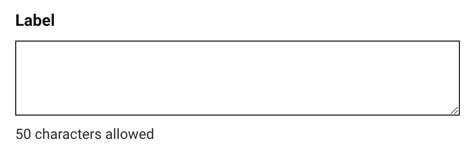 Textarea documentation
<Logo />
- Added new brand
QBank.
<Logo brand="qbank" />
- Updated mobile sizing for the following brands:
IAG
- width updated from
80pxto64px - height updated from
66pxto64px - xs width updated from
53pxto48px - xs height updated from
44pxto48px
ANZ
- xs width updated from
144pxto105px - xs height updated from
48pxto35px
BNZ
- xs width updated from
100pxto62px - xs height updated from
49pxto30px
Chroma
- xs width updated from
168pxto133px - xs height updated from
38pxto30px
Driva
- xs width updated from
109pxto89px - xs height updated from
22pxto18px
Monochroma
- xs width updated from
168pxto133px - xs height updated from
38pxto30px
NAC
- xs width updated from
145pxto118px - xs height updated from
37pxto30px
NZI
- xs width updated from
93pxto76px - xs height updated from
49pxto40px
ROLLiN
- xs width updated from
124pxto86px - xs height updated from
58pxto40px
Documentation
<Textarea />
- Added character counter example
<Favicon />
- Updated documentation to include
<Helmet>implementation.
Assets / Svgs
- Added
Backed by IAGlogos to documentation.
Additional
Added version dropdown to the docs navbar activated by clicking on the current version number link.
Allow brand query for brand/theme, eg.
?brand=colesand?brand=cgu&theme=navy.Updated github workflows included a new package only deployment and Nexus fix.
- Updated migration guides for bit and chroma-react.
Added release dates and release pull request url to the release notes.
- Updated the IAG logo for the documentation.
Figma
- Textarea text layers reconnected to display correct font styling.