Button
The Button component allows users to perform or trigger an action.
- Usage
- Examples
- Properties
- Accessibility
- CSS Variables
Usage
Buttons are interactive components that trigger events or actions. Their labels inform users what will happen when users interact with them. Buttons are designed to stand out from the surrounding content, making call-to-action prompts clear and noticeable to users.
In Chroma, there are three types of buttons: CTA, Brand, and Functional. Each type plays a crucial role in ensuring accessibility and consistency across applications and brands. The Button variants section below will help you choose the best button style for your specific context and user need.
Installation
Install
yarn add @iag/chroma-react-ui.components
Import
import { Button } from "@iag/chroma-react-ui.components";
When to use
Use Buttons to trigger an action such as submitting a form, confirming a decision, or initiating an operation. Use them to create a clear path or next step for user journeys.
When to avoid
Avoid using Buttons for navigation purposes. If the intended action is to direct users to another page or a different section of the same page, use a link instead. Also avoid for hiding and displaying content or sections where an action is not triggered, and for elements that are not meant to be interactive.
Do
- Do ensure Buttons trigger an action or a series of actions.
- Do make Button labels short and specific to the action it performs (e.g. Add to cart, Download report).
- Do use sentence case for Button labels unless referring to specific titles (e.g. Download the Annual Report).
- Ensure the Button stands out and are clearly identifiable as a Button.
Don't
- Don't use generic or device dependent labels like "Click here" or "Submit". They do not provide sufficient information about what the button does.
- Don't use all-caps as it can present accessibility barriers.
Button variants
CTA Buttons (CTA1, CTA2 and CTA3)
CTA buttons align with a brand’s call to action hierarchy. Each level is assigned a specific style to ensure consistency in CTAs when switching between brands. For instance, a brand's priority 1 call to action is typically associated with its primary colour, however some brands use secondary or accent colours. By utilising these pre-styled buttons, call to action buttons will automatically maintain their desired styling without the need for manual button overrides when brand switching.
CTA buttons have 3 levels:
- CTA 1 - use for the most important or primary actions on a page, such as "Next", "Submit" or "Save."
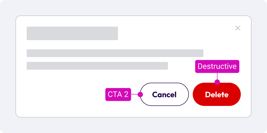
- CTA 2 - use for secondary actions that are important but not primary, such as "Back", "Cancel" or "Edit."
- CTA 3 - use for less critical or tertiary actions such as "Learn More", "View Details" or "Help."
Benefits of using CTA buttons:
- Ensures users can easily identify primary, secondary, and tertiary call to actions on a page.
- Reduces accessibility issues in white-label applications where brand colours may change.
- Provides a consistent user experience, regardless of the brand's colour scheme.
Keeping navigation consistent for accessibility
Consistency in navigation is key to making experiences accessible. The Web Content Accessibility Guidelines (WCAG) cover the importance of keeping navigation items, such as buttons, consistent across multiple pages, unless the user decides to change it. CTA buttons help achieve this requirement by providing a consistent style to button hierarchy, enhancing the accessibility of your site for all users.
Brand Colour Buttons (Primary, Secondary, and Accent)
Brand colour buttons are designed to match the brand's colour scheme.
There are 3 Brand colour buttons that come in Solid, Outline, Text, and Inverse variants:
- Primary - uses the Primary brand colour
- Secondary - uses the Secondary brand colour
- Accent - uses the Accent brand colour
Example usage:
- In situations where the colour is the necessary aspect for the interface. For example, on campaign or promotional pages.
- When placed on brand colour background. For example if you have a Primary colour header or banner, using the Primary Inverse button will ensure the button and background maintain accessibility when switching brands.
Test in all brands when using Brand colour buttons
Make sure to test in all brands when using Brand colour buttons, to ensure they are accessible when brand switching. Some brands may use lighter colours for primary, secondary or accent, which can render buttons inaccessible on white backgrounds. If you find this is happening, consider the use of CTA buttons.
Functional Buttons
Functional buttons have specific usages and come in Solid, Outline, Text, and Inverse variants.
Interactive Button
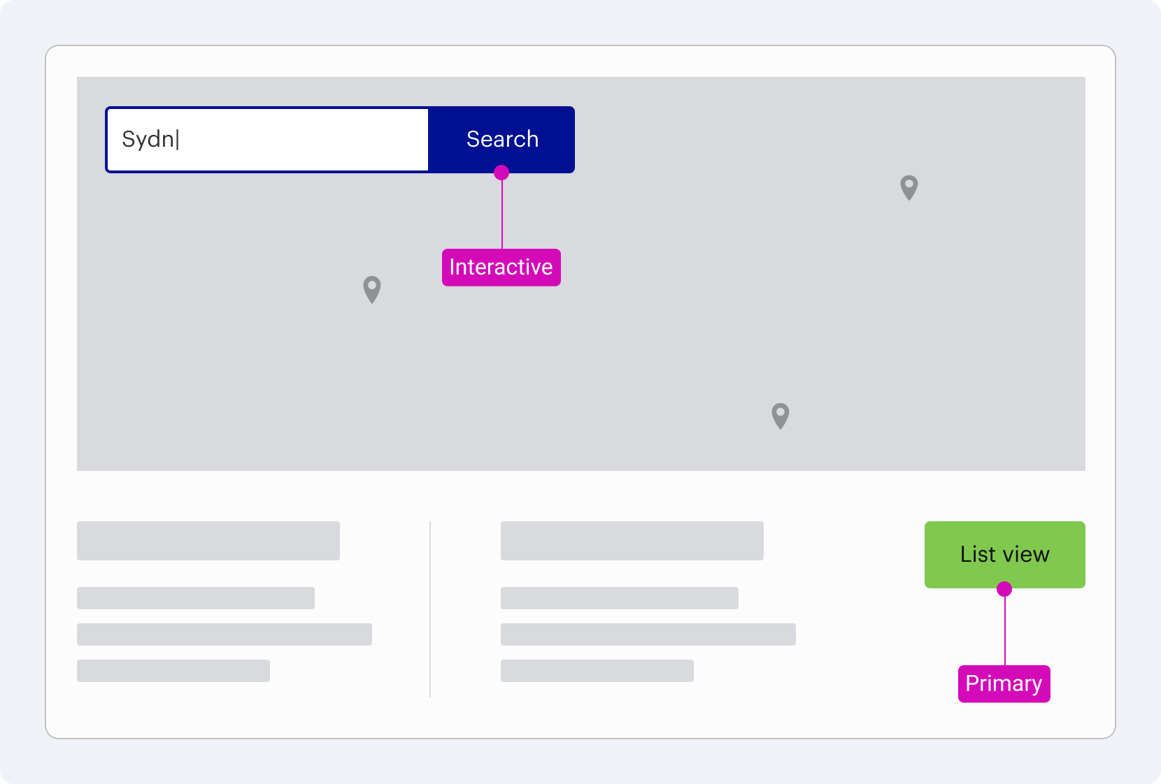
Interactive buttons inherit the interactive colour, ensuring that when combined with form elements, they match in colour and create consistent styling when building interactive patterns. This approach is particularly beneficial when working with Input Group components, as it maintains a cohesive look where a brand's primary colour differs from its interactive colour.
Example usage: An Input Group component should use the Interactive colour button to ensure it matches the focus and hover states of the input field. Using the Primary button may result in a mismatch, where a brand does not use their Primary colour as their Interactive colour. In the example below, the Interactive colour is blue, where the Primary colour is green.
Destructive Button
Destructive buttons should be used for actions that have potentially destructive or irreversible consequences, such as "Delete," "Remove," or "Deactivate."
Example usage: In a Modal to confirm a Delete action triggered by the user.
Button grouping
If two buttons are presented in a group, they should be placed inside a Button Group component.
Button vs links
Links and buttons have different purposes. Buttons are used to trigger an action while links are used to navigate to a new URL. They also operate differently for keyboard-only users so it’s important to use the right element to all your users to navigate content and applications with ease.