V8 Releases
v8.0.0
Brand Tokens
Global Tokens
New global colour tokens added.
supplementary-1supplementary-2supplementary-3
Example
--color-global-brand-supplementary-1-50: #fdfdfd;
--color-global-brand-supplementary-1-100: #f9f9f9;
--color-global-brand-supplementary-1-200: #f3f3f3;
--color-global-brand-supplementary-1-300: #ebebeb;
--color-global-brand-supplementary-1-400: #e5e5e5;
--color-global-brand-supplementary-1-500: #e0e0e0;
--color-global-brand-supplementary-1-600: #bebebe;
--color-global-brand-supplementary-1-700: #898989;
--color-global-brand-supplementary-1-800: #5a5a5a;
--color-global-brand-supplementary-1-900: #2d2d2d;
--color-global-brand-supplementary-1-950: #0b0b0b;
Foundation Tokens
New foundation colour tokens added.
supplementary-1supplementary-2supplementary-3
Example
--color-foundation-supplementary-1-lighter: #fdfdfd;
--color-foundation-supplementary-1-light: #ebebeb;
--color-foundation-supplementary-1-default: #e0e0e0;
--color-foundation-supplementary-1-dark: #898989;
--color-foundation-supplementary-1-darker: #2d2d2d;
--color-foundation-supplementary-1-contrast: #121212;
--color-foundation-supplementary-1-beside: #ffffff;
--color-foundation-supplementary-1-neutral: rgba(255, 255, 255, 0.15);
--color-foundation-supplementary-1-block: #ebebeb;
--color-foundation-supplementary-1-neutral-solid: #3e3e3e;
Button Tokens
New button colour tokens added.
supplementary-1supplementary-2supplementary-3
Example
--color-foundation-button-supplementary-1-lighter: #fdfdfd;
--color-foundation-button-supplementary-1-light: #ebebeb;
--color-foundation-button-supplementary-1-default: #e0e0e0;
--color-foundation-button-supplementary-1-dark: #898989;
--color-foundation-button-supplementary-1-darker: #2d2d2d;
--color-foundation-button-supplementary-1-contrast: #121212;
--color-foundation-button-supplementary-1-beside: #ffffff;
--color-foundation-button-supplementary-1-neutral: rgba(255, 255, 255, 0.15);
--color-foundation-button-supplementary-1-block: #ebebeb;
New button size tokens added.
--button-size-xs-font-size: 1rem;
--button-size-xs-padding: 0 0.5rem;
--button-size-xs-height: 2rem;
--button-size-sm-font-size: 1rem;
--button-size-sm-padding: 0 0.75rem;
--button-size-sm-height: 2.25rem;
--button-size-md-font-size: 1rem;
--button-size-md-padding: 0 1rem;
--button-size-md-height: 2.5rem;
--button-size-lg-font-size: 1rem;
--button-size-lg-padding: 0 1.25rem;
--button-size-lg-height: 2.75rem;
Border Tokens
New border colour tokens added.
--color-border-supplementary-1: #e0e0e0;
--color-border-supplementary-1-light: #ebebeb;
--color-border-supplementary-2: #e0e0e0;
--color-border-supplementary-2-light: #ebebeb;
--color-border-supplementary-3: #e0e0e0;
--color-border-supplementary-3-light: #ebebeb;
Text Tokens
New text colour tokens added.
Example
--color-text-supplementary-1: #e0e0e0;
--color-text-supplementary-1-light: #ebebeb;
--color-text-supplementary-2: #e0e0e0;
--color-text-supplementary-2-light: #ebebeb;
--color-text-supplementary-3: #e0e0e0;
--color-text-supplementary-3-light: #ebebeb;
Background Tokens
New background colour tokens added.
Example
--color-background-supplementary-1: #e0e0e0;
--color-background-supplementary-1-light: #fdfdfd;
--color-background-supplementary-2: #e0e0e0;
--color-background-supplementary-2-light: #fdfdfd;
--color-background-supplementary-3: #e0e0e0;
--color-background-supplementary-3-light: #fdfdfd;
Components
<Button />
Button
sizeprop has new brand tokens added to control thepaddingandfont-size.
<Modal />
New MUI based
<Modal />component, see Modal migration guide
<Alert />
Added
borderWidthandborderRadiustokens to theAlertcomponent as well asborderColortokens to theAlertvariants in preperation for the NRMA 3.0 updates.Added
border-widthandborder-radiusattributes to theAlertcss class,border-colorattributes to theAlertvariants css classes and an.alert--bannerclass in preparation for the NRMA 3.0 updates.Added a
bannerprop to theAlertcomponent to allow for thealert--bannerclass to be applied to theAlertcomponent and updated the docs with an example of how to use thebannerprop.
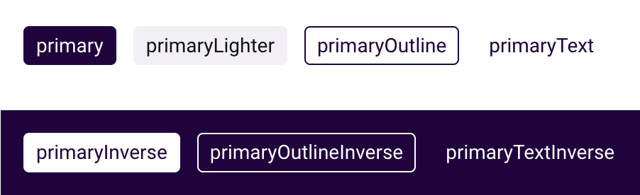
<Badge />
New variants added:
outlineoutlineInversetexttextInverse
 View badge documentation
Tailwind Configuration
New
supplementarycolour tokens added to the tailwind configuration.
Assets
NRMA Logos
logo-alt-1.svgrenamed tologo-alt-3.svg.- New
logo-alt-1.svgdarkandlightlogo added. - New
logo-alt-2.svgdarkandlightlogo added. - New
logo-alt-4.svgdarkandlightlogo added.
NRMA Logo Alt 1
NRMA Logo Alt 2
NRMA Logo Alt 3
NRMA Logo Alt 4
Documentation
Assets
- New
Logossubsection added to the assets documentation. - New page added to the logos subsecton
IAG Direct Brands. - New page added to the logos subsecton
Partner Brands. - New page added to the logos subsecton
Alternate Logos.
Brand Exploration
- Colour swatches added to the brand exploration page.
Brand Colours
- Colour documentation updated to display colour swatches.
- Colours separated into tabs.
- New supplementary colour documentation added.
System Colours
- Colour documentation updated to display colour swatches.
- Colours separated into tabs.
Text Colours
- Colour documentation updated to display colour swatches.
- Colours separated into tabs.
Figma
- Link Button variant added.
Button height updated to pull theme token instead of global in order to recognise brand overrides.
- NRMA small link bold font updated to include missing underline.